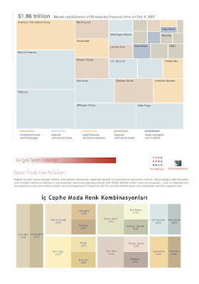
I found the color charting in the New York Times of the Wall Street firms’ descent into loss oddly similar to Marshall’s Most Preferred Colors chart (I promise this is the last time I will post something on Marshall’s until I have the actual paint on the walls!). Does someone consult a color expert when doing these charts? How is it I was mesmerized by the placement of the color blocks rather than focusing on the crisis?
Color chart
Previous post: Gretchen Wagoner
Next post: Pantone Spring 09